Overlack is an international distribution company focusing on basic and specialty chemicals. The brief was to completely overhaul the company’s corporate identity.
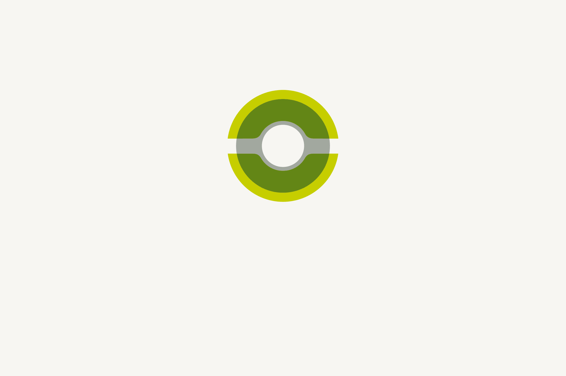
We decided to create a new logo modelled on the existing one, which was based on the O of Overlack, to ensure recognisability and continuity following the relaunch.
The new logo combines three different elements. The O stands for Overlack and serves as a link to the old logo, and we added a C for chemicals. Laid one over the other, the two create a turntable and a round flask, a strong symbol for the chemical sector.
We developed: brand positioning, logo family, core identity elements (colours, fonts, etc.), business stationery, ads, signage, exhibition stand, website